| Full-color photo of the SoCal sky (that’s the Pacific Ocean at the bottom) |
How it looks on the HP Prime. See the horizontal streaks? |
|---|---|
 |
 |
There’s an easy way to “fix” photos to eliminate those streaks using your favorite image editing program. It takes only three steps:
- Open your program’s “Reduce colors to 32K” window.
- Select “error diffusion” or “dithered”. Do NOT select “nearest color”. If you select “dithered”, select any kind OTHER than “ordered”.
- Save the result to a new 16-million color PNG file, NOT a JPG file.
| Original full-color photo (not on Prime) | How it looks on the HP Prime after being “fixed”. No horizontal streaks! |
|---|---|
|
 |
Here are a few more comparisons (all taken from Joe’s Prime Pix Gallery ) of how much better some photos look on the HP Prime when they are “fixed” as described above before being sent to the Prime.
| What the original full-color file looks like on the HP Prime: |
How it looks on the HP Prime after being “fixed” first: |
|---|---|
 Streaks in several directions |
 No streaks |
 Blotchy skin |
 Touchably smooth knee |
 Rainbow between their faces |
 No rainbow. Smooth gradient. |
 Even nighttime skies get streaky |
 Visible dithering, but much better! |
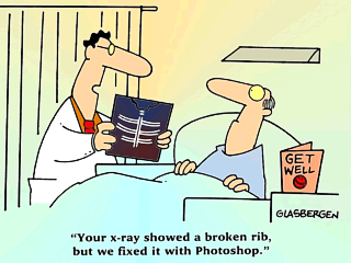
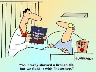
However, there are times when “closest color” gives better results than “error diffusion” or “dithered”, usually when there are large areas containing a single color, as is often found in simple computer graphics (e.g. charts) and drawings. Sometimes you have to try both and see which is better. Here’s an example of “closest color” giving better results:
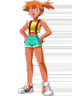
| Full-color original cartoon: | Using “error diffusion” introduces “noise” (contrast boosted to make it more visible): |
Using “nearest color” gets better results: |
|---|---|---|
 |
 |
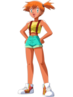 |
Unfortunately, if you look closely, you can see that in the original picture of Misty on the left, her skin is slightly darker than in the modified image on the right. Color reduction using “nearest color” often changes large areas of color this way. But it’s close enough, and at least there is no annyoing “noise” like in the middle image. So in this case, using color reduction with the “closest color” produced the best results.
Bottom line: If an image looks bad on your Prime, reduce it to 32K colors first. If it’s a photo with smooth gradients, use “error diffusion” or “dithered”, but if it’s a drawing with areas of solid colors, use “closest color”.